Nintendo Updates Official Super Mario Logo for the First Time in 15 Years
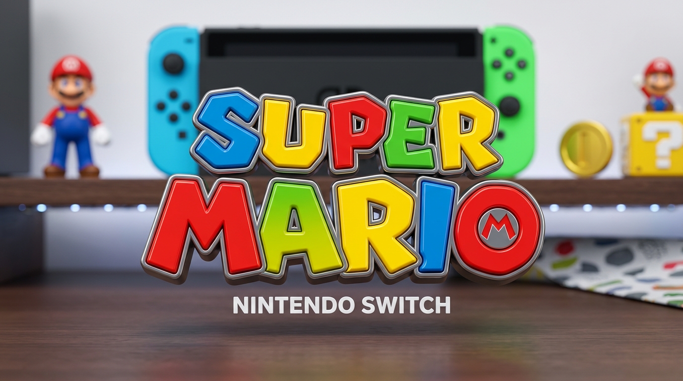
Fifteen years after its last official design revision in 2011, Nintendo has finally updated the iconic Super Mario franchise logo. Without any corporate fanfare or flashy press conferences, the Japanese gaming giant quietly deployed the refreshed branding across its official regional web portals worldwide.
While the timeless primary color scheme and legendary letterforms remain instantly recognizable, the visual departure from the flat, two-dimensional aesthetic of the past decade is immediately noticeable.
A 3D Dimensional Makeover with Metallic Accents
The most striking shift is the departure from flat 2D vector styling in favor of physical, three-dimensional depth. The heavy black stroke that previously outlined each letter has been swapped out for a refined, metallic silver-gray border featuring realistic lighting reflections, subtle beveling, and soft gradients.
The resulting design boasts a distinct toy-like physical presence, echoing the visual charm of Super Mario 3D World and the high-end CGI renders seen in recent animated projects. Nintendo has also transitioned primary web placements toward a single-line horizontal format, phasing out the stacked multi-line presentation that dominated retail boxes and promotional banners throughout the Switch era.
Enhanced Character Renders Down to the Overalls Stitching
This brand refresh extends well beyond the wordmark itself. Along with the updated typography, Nintendo refreshed its high-resolution 3D character renders of Mario across its official hubs. Enthusiasts quickly spotted a remarkable surge in micro-details across the plumber's signature attire.
Mario's denim overalls now showcase authentic fabric weave textures, visible perimeter stitching, and functional front pockets, moving past the simplified smooth surfaces of previous assets. Even his white gloves and cap feature heightened material fidelity, highlighting a deliberate push toward higher graphic fidelity for the mascot.
The Visual Signal for Nintendo's Next Hardware Chapter
Historically, Nintendo alters the visual identity of its crown jewel with extreme caution. Every major revision has coincided with an epochal hardware transition, from the dawn of polygonal 3D on the Nintendo 64 to the stereoscopic era of the 3DS.
Following the major announcements from the recent September 2026 Nintendo Direct and mounting industry focus on next-generation hardware preparations, this subtle visual upgrade serves as the aesthetic opening salvo for what lies ahead. Nintendo rarely touches its core mascot without purpose, and the foundation for Mario's next era is now officially set.

SEO consultant for over 20 years and digital entrepreneur, Charles 'Grimtag' Ronchain is the founder of Pro-Gamer.gg, Retrocharting.com, and Gamescharting.com. A competitive gamer, streamer, and retro game collector, he has worked in the video game industry for over 15 years, notably as a consultant for leading price comparison platforms. Passionate about real-time performance data and gaming technology, he analyzes competitive esports, gaming hardware benchmarks, and creator workflows on Pro-Gamer.gg with an authentic player perspective.